2026” 禮映仲秋
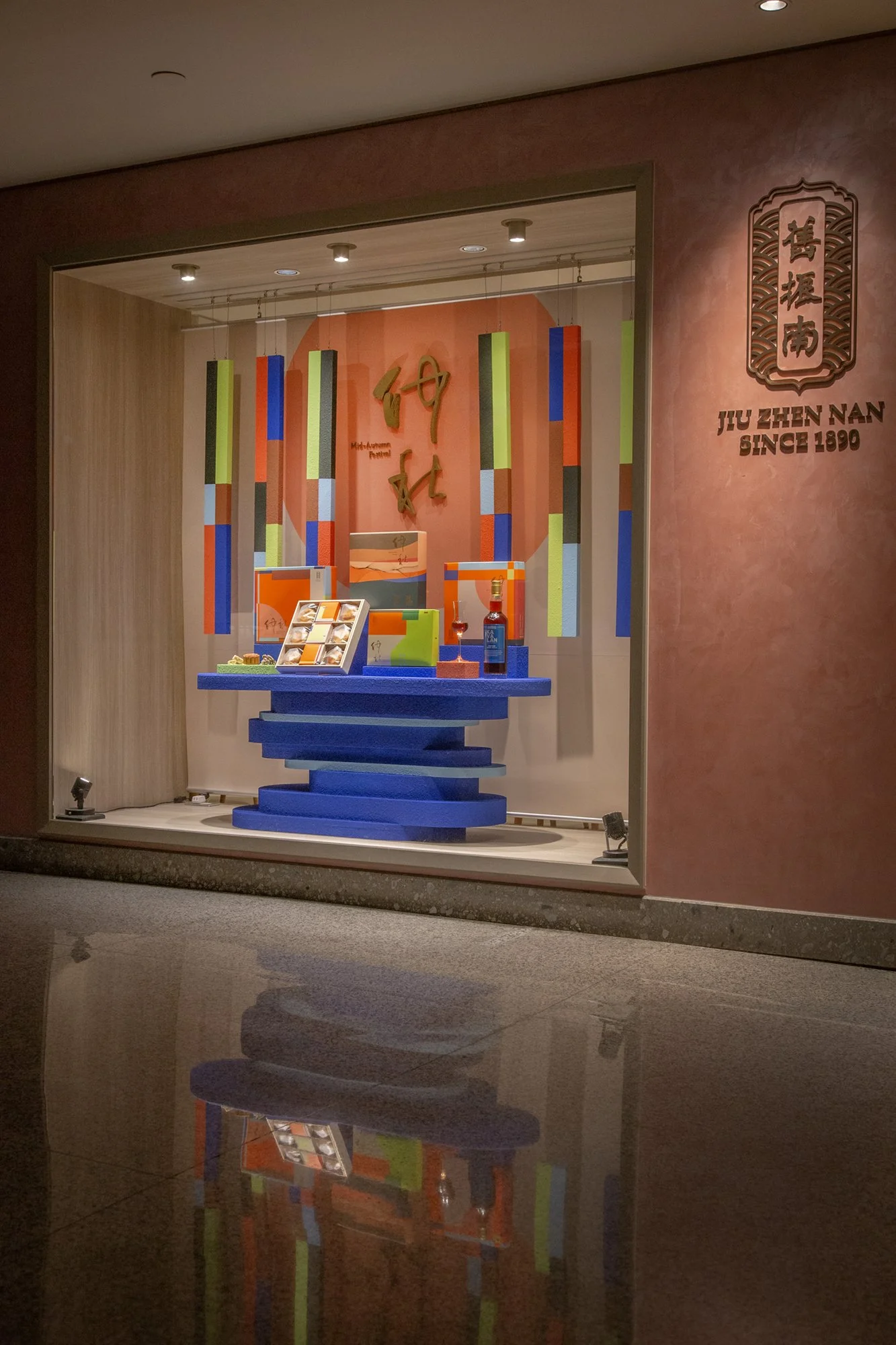
延續品牌中秋禮盒的色彩與圖像,將平面的色塊延伸成立體的幾何吊掛裝置,讓禮盒的視覺走進櫥窗。
背景的大圓弧像是一輪升起的明月,而下方層層堆疊的展示桌則以湖面為想像,如同月色映照在水面上,在視覺上營造出流動的仲秋氣息。
The window display extends the colors and graphics of the Mid-Autumn gift box into three-dimensional geometric hanging elements, bringing the visual language of the packaging into the space. A large curved form in the background resembles a rising full moon, while the layered display table is inspired by the surface of a lake, evoking the reflection of moonlight on water and creating a sense of movement throughout the Mid-Autumn scene.
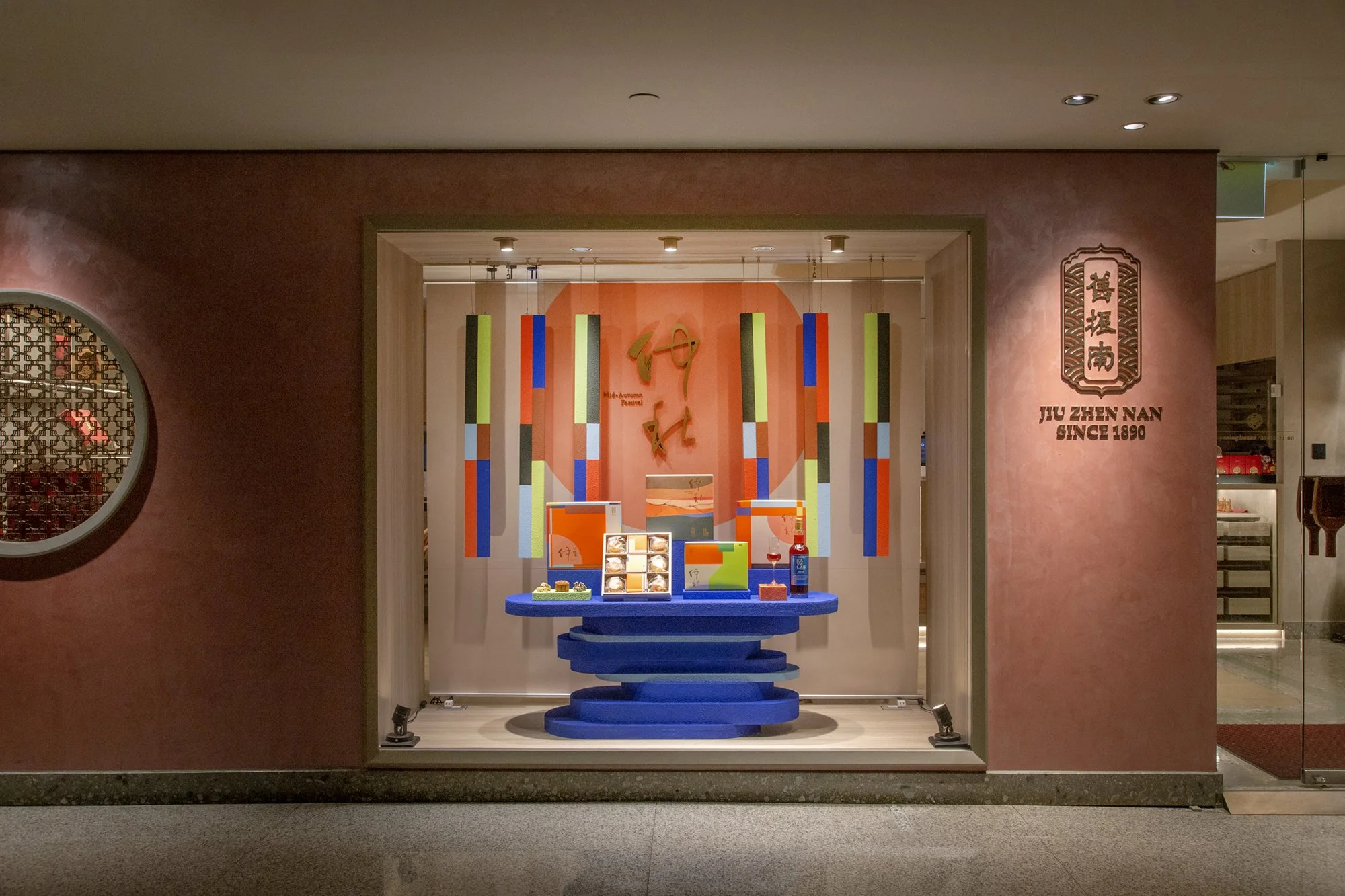
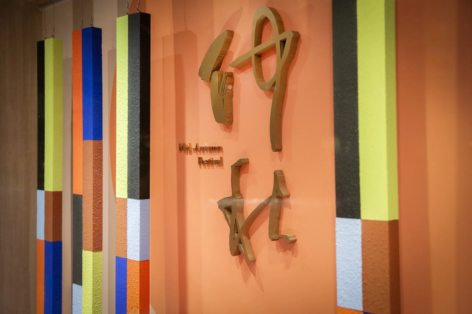
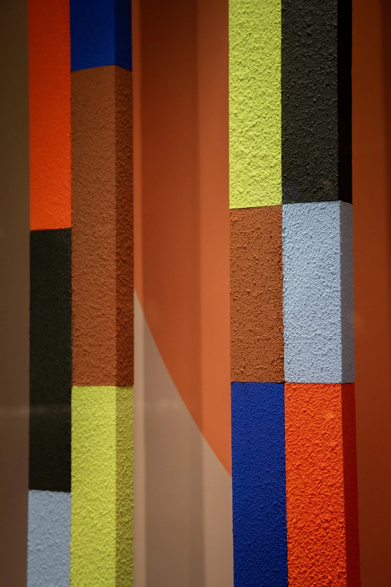
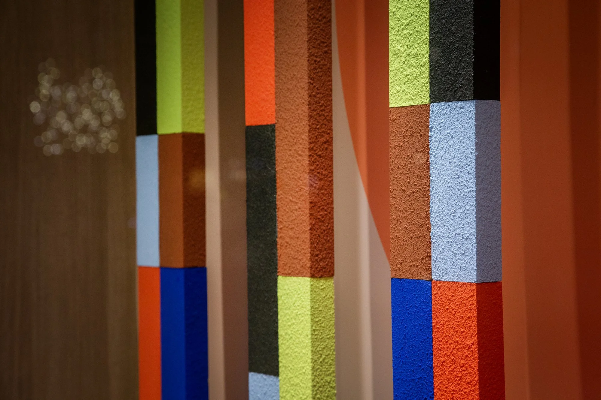
櫥窗中的吊掛立柱延伸自禮盒上的色塊,以不同的比例與高度錯落排列,像是中秋夜裡燈火亮起的城市街景。
以幾何化的線條與色彩,呈現城市大樓群聚的景象,也讓原本平面的禮盒視覺多了一點想像的空間感。
The hanging columns in the window display are inspired by the color blocks on the gift box, arranged at different proportions and heights to evoke a cityscape illuminated on a Mid-Autumn night. Geometric lines and colors come together to suggest a cluster of urban buildings, giving the original flat packaging design a greater sense of space and imagination.
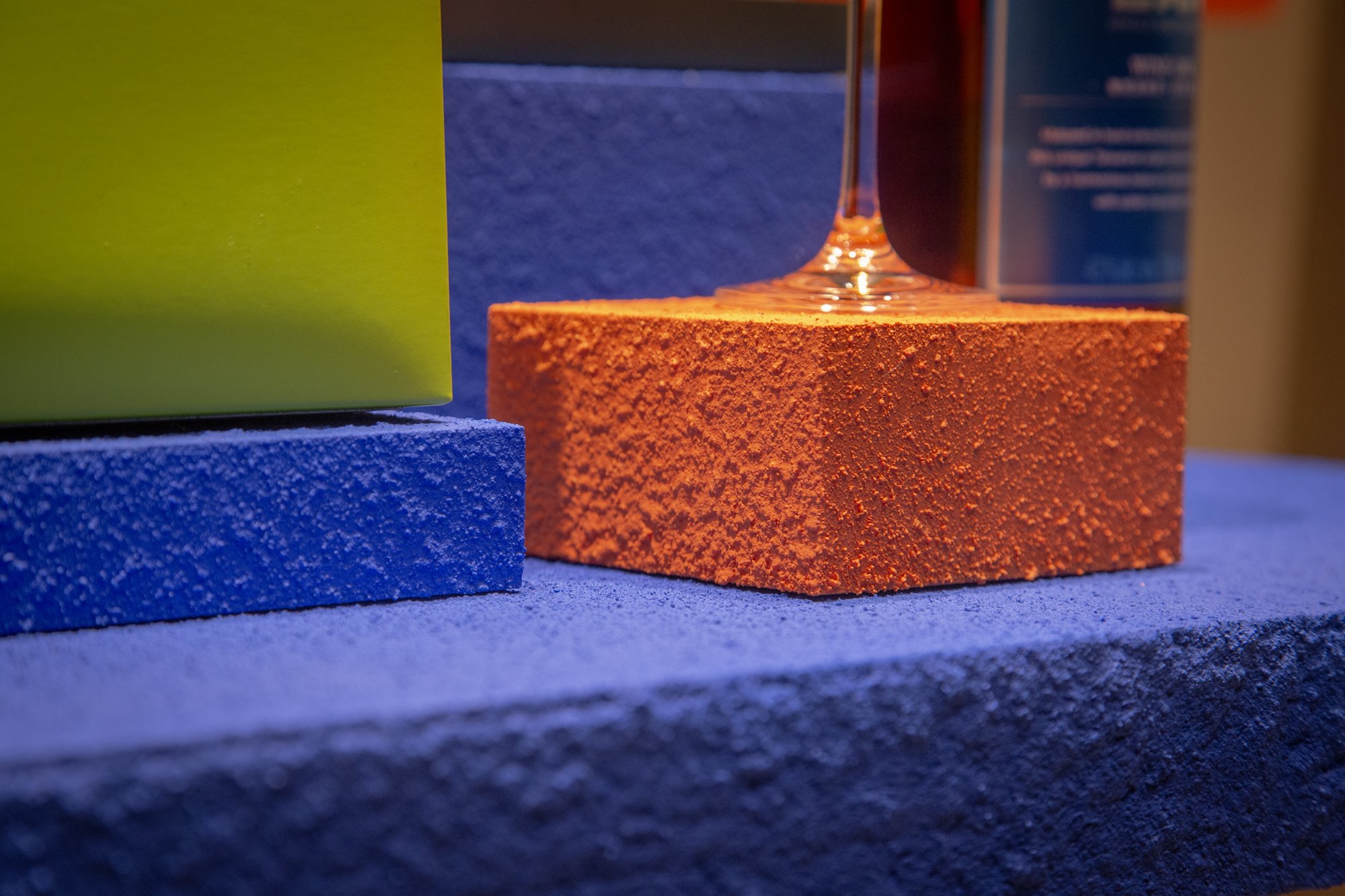
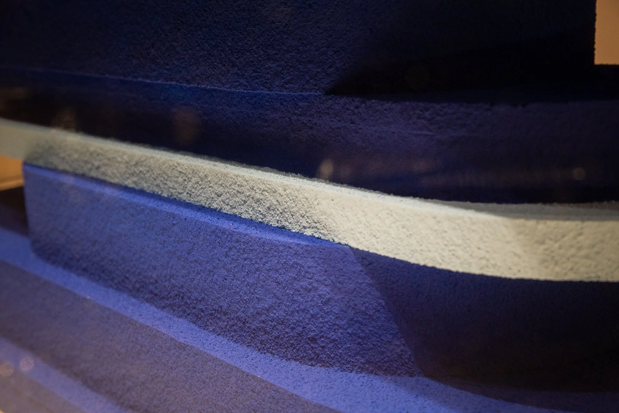
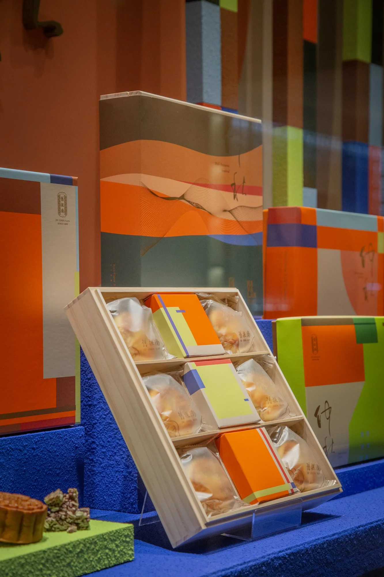
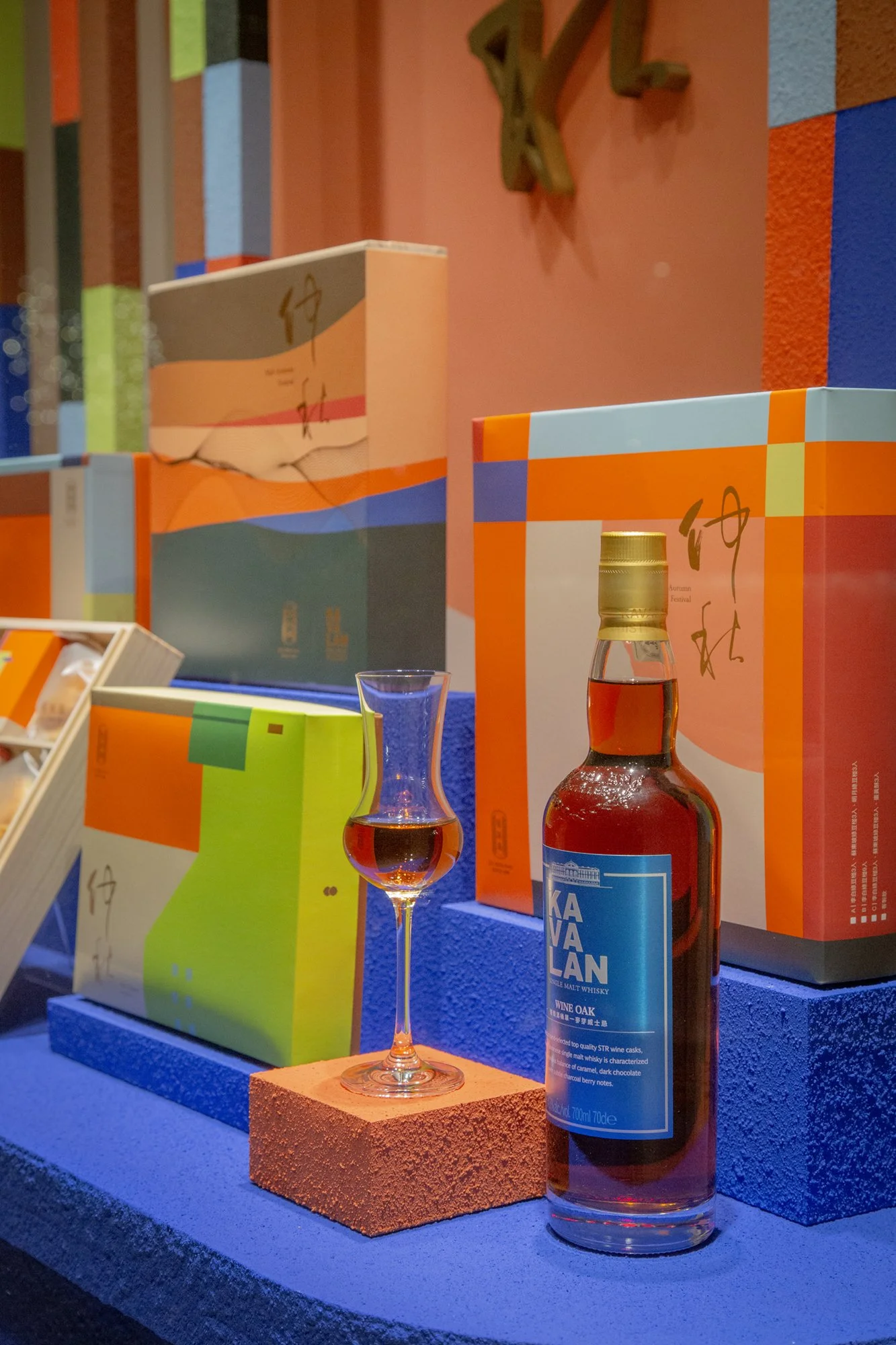
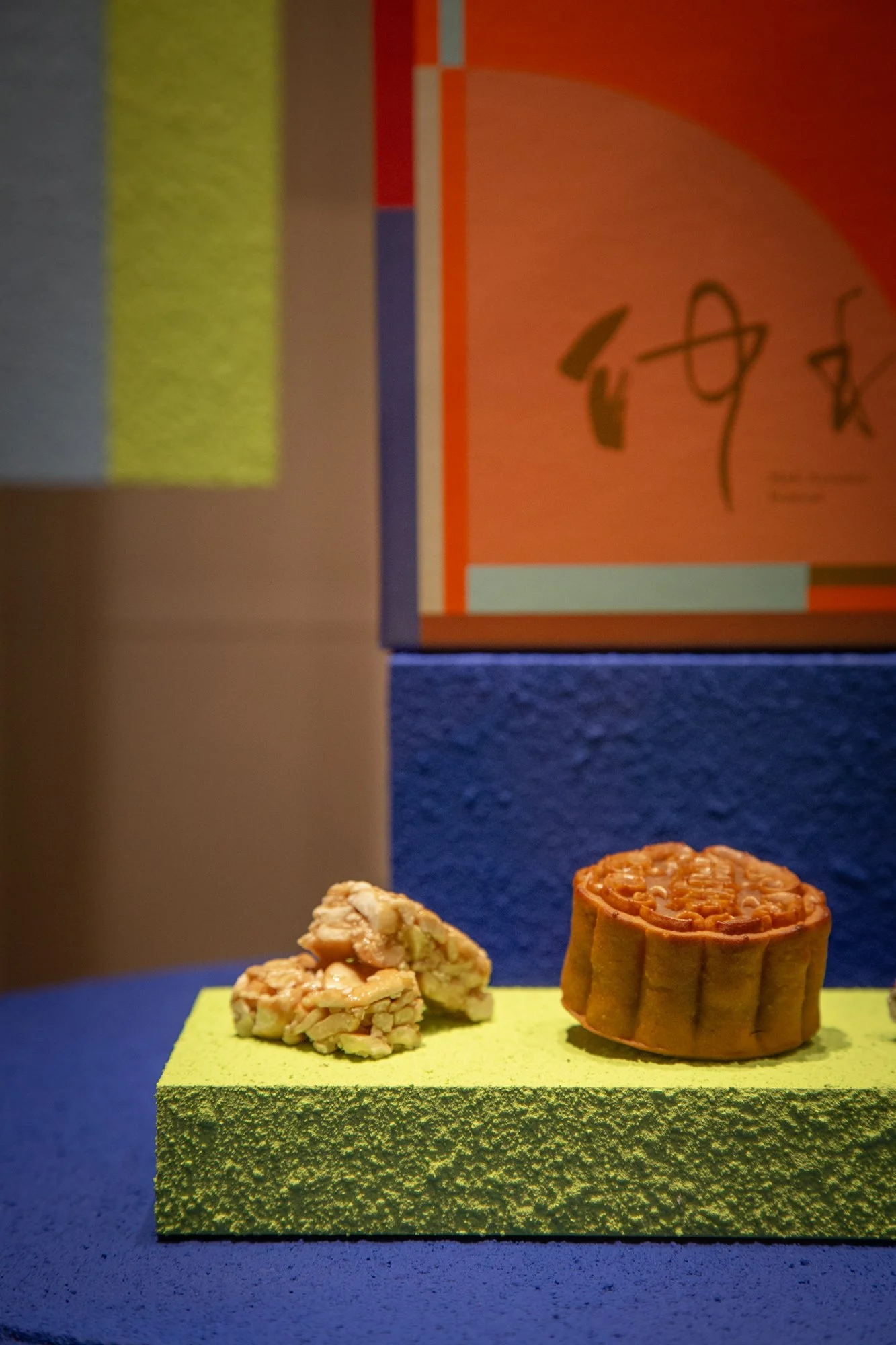
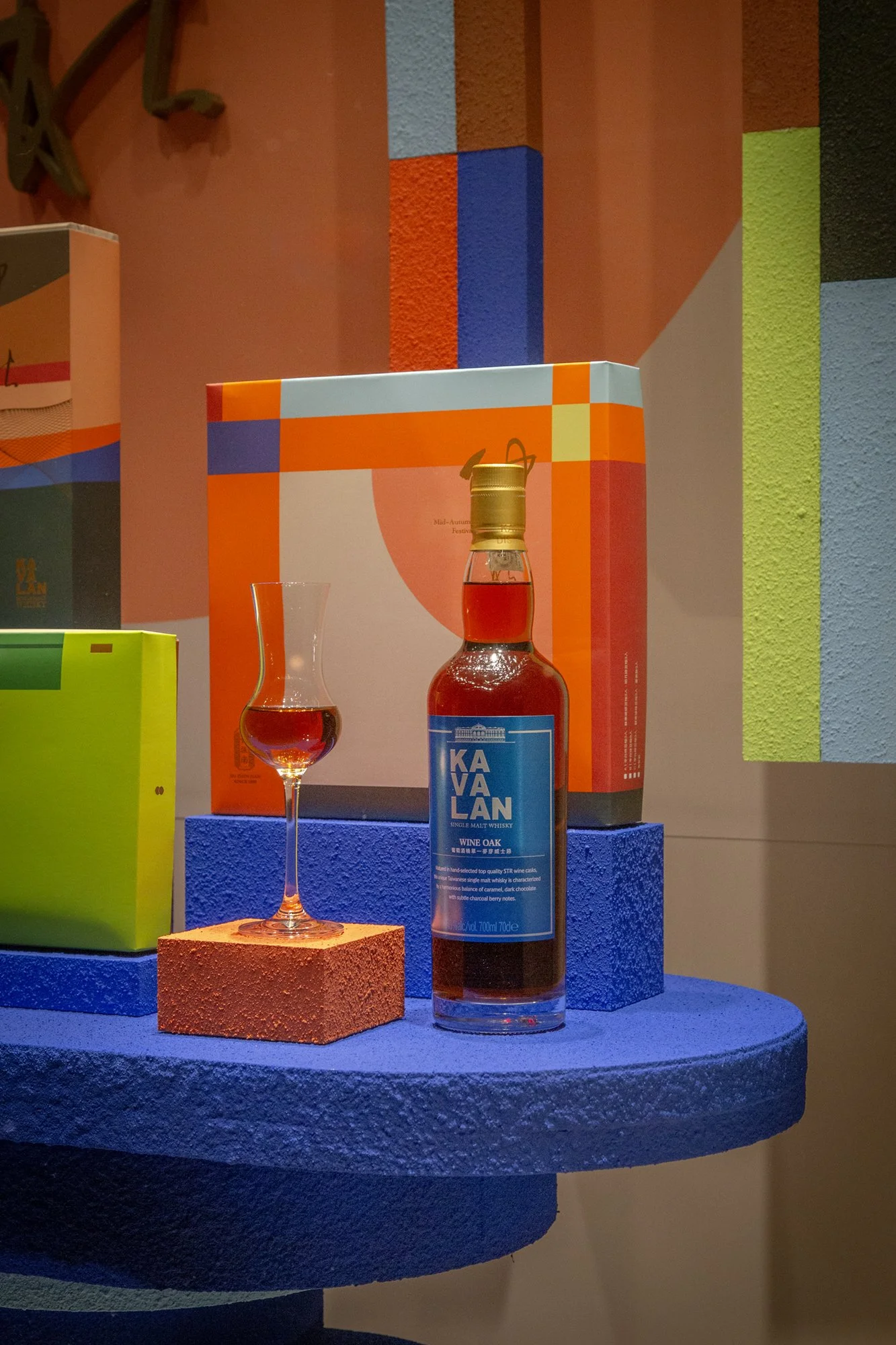
由於禮盒本身就有很豐富的色彩,因此在陳列上也延續相同的配色,讓禮盒、展示台與背景自然地串連。
不同尺寸的禮盒搭配層層堆疊的色彩平台,像一件大型的立體雕塑作品,也讓商品成為櫥窗風景的一部分。
With its rich and colorful palette, the gift box naturally extends into the display, creating a visual connection between the products, platforms, and background. Gift boxes in different sizes are arranged across layers of colored platforms, creating the feeling of a large-scale sculptural installation and allowing the products to become part of the window display itself.