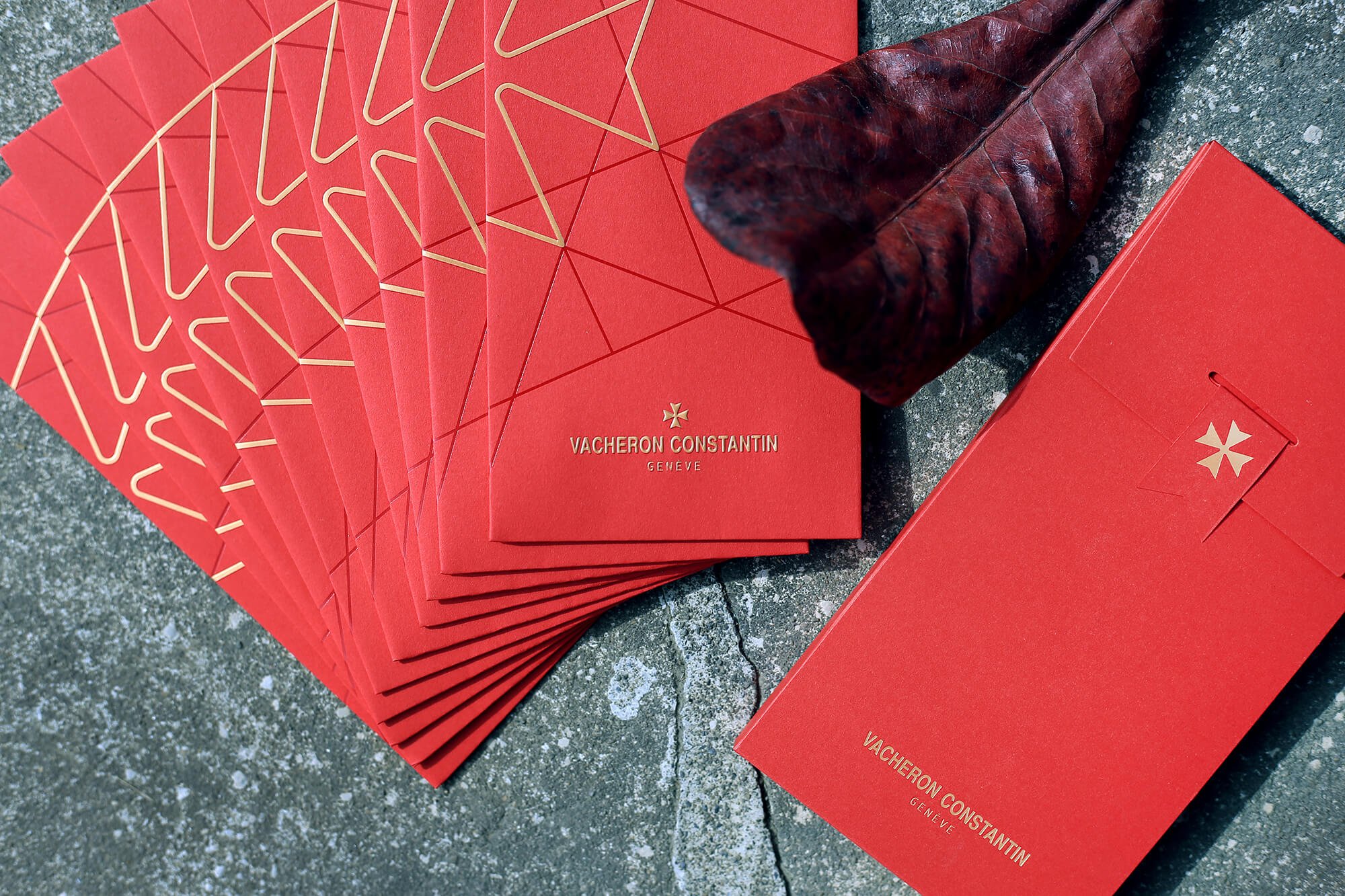
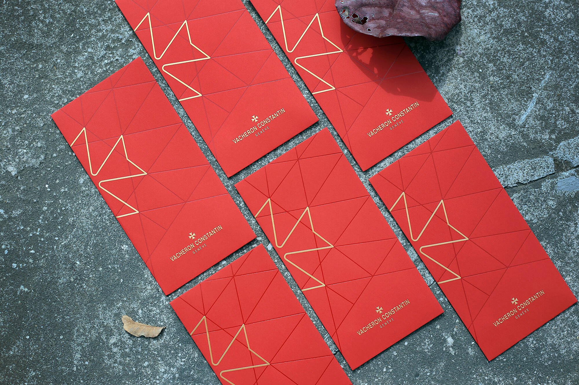
江詩丹頓紅包袋設計|VACHERON CONSTANTIN Red Envelope Design
“越簡單的,越不簡單。”
在紙材的選用或是印刷的工法上,我們嘗試了多種不一樣的燙金箔以及挑戰印刷廠實力的細線打凸+多層燙金,只為了符合品牌本身低調且細緻的特質。
封口處帶有馬爾他十字的小旗幟,是本次為品牌紅包袋設計的小巧思,祝福大家牛年行大運!
"The simpler it looks, the more complex it is."
We explored various foil stamping techniques and pushed the limits of fine embossing combined with multilayered foiling—each decision aimed at reflecting the brand’s understated yet refined character. A small flag at the seal, featuring a Maltese cross, adds a thoughtful touch to the design—our little surprise for the Lunar New Year red envelope. Wishing everyone a prosperous Year of the Ox!


